Our groups experience throughout this exercise has helped us to analyze the more overlooked details of the ways a person would interact within the space we designed. We needed to take into consideration the personal space that people need for themselves while in public spaces. Throughout our research we discovered that a majority of those waiting for the bus would stand outside of the bus shelter because of the relationship of proxemics and the space, even during inclimate weather. One aspect that we overlooked in the beginning of our design process is the how those with special needs would access and interact with our bus|shelter and shelter|bus. We thought about the space that one would require to walk around, but we did not consider the room that a wheelchair would need to maneuver around the bench inside of the bus|shelter. Handicap accessibility is one part that we explored in the codes+ charrette and we now realize how important it is to plan and design for all possible clients.
We would like to recommend that other designers should take into consideration the varying abilities that different clients may have. All spaces should be easily accessible for those in wheelchairs, visual language such as signs should be used to let the deaf know how to interact within the given space, and certain spacing standards should be used when trying to accommodate for the blind. As design students and professionals we need to put ourselves in the clients position and ask ourselves," Is this space user-friendly to me and my needs?" Then we need to analyze the whys and the why nots and tweak our design to make it universally accessible, whether it is someone who is in a wheelchair or simply someone who might be very short or very tall.
All designers should research codes and design standards as part of their initial design process. The amount of information may be overwhelming at first, but codes can actually be a very helpful starting point. The perimeters they set make the end result a more feasible design. In the future, our group needs to take our designs to the next step past simple aesthetics. The codes and standards that we were able to look up in class gave us some perspective into the more functional side of design that we will definitely put into use in our future projects.

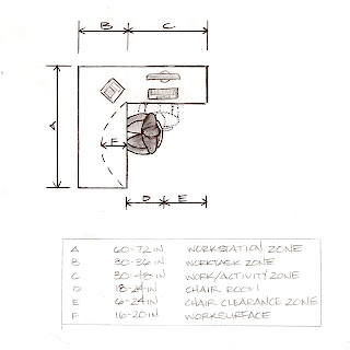
In our Communication shelter|bus we needed to have workstations so volunteers could process the victims information to add them to a central database. We researched standards for the amount of room needed for a workspace. There needs to be adequate room for a computer screen, keyboard, mouse, documents, and various office supplies. We also looked at the amount of clearance needed for for an office chair to maneuver properly.

On our shelter|bus for Counseling we needed to take into consideration proxemics when it came to planning the different spaces. In individual counseling, the relationship between the two individuals would probably be more personal because it is only two people talking to one another. Therefore the amount of space needed between the seating wouldn't have to be more than 4 feet. This gave us a good idea of the size of the rooms we needed.

Our group thought it was important that counseling should be available to all victims. In order for everyone to be seen we thought group therapy would give volunteers the opportunity to reach out to more victims in a shorter amount of time versus individual sessions. We thought that the dynamics of the group would most likely be more social than personal just because it would be more than two people interacting with each other. This led us to the use of social spacing of 4 to 12 feet in between the seating.
For the rest of the diagrams for our bus|shelter and shelter|bus codes, ergonomics, and proxemics click on the different links to my teammates individual blog. Enjoy!

No comments:
Post a Comment